iOS 26.1’s New Liquid Glass Setting Is a Win for Apple and Users Alike
Apple’s latest software update, iOS 26.1 (developer beta 4), introduces a subtle but meaningful change to the company’s bold new interface design — the Liquid Glass visual language—by giving users more control over its transparency and appearance.
A design refresh with deeper roots
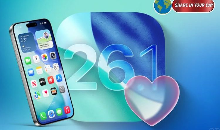
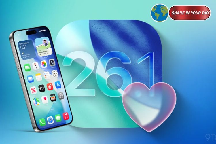
Last month, Apple rolled out iOS 26 (alongside iPadOS 26 and macOS 26), introducing the Liquid Glass aesthetic: translucent backgrounds, layered icons and semi‑transparent menus designed to feel like “frosted glass” over dynamic content. The look aimed to set Apple’s interface direction for the decade ahead.
However, the sweeping change drew mixed reactions: many users praised the modern aesthetic, while others reported issues with legibility and visual distraction in certain lighting or wallpaper conditions.
The new toggle: “Clear” vs “Tinted”
In response to feedback, iOS 26.1 adds a new setting located under Settings > Display & Brightness > Liquid Glass on iPhone and iPad, and under System Settings > Appearance on Mac.
The menu offers two options:
- Clear: Retains the original ultra‑transparent Liquid Glass look.
- Tinted: Increases opacity and adds contrast, enhancing legibility while maintaining the design aesthetic.
Apple explains that the “Tinted” mode makes background elements subtler and menus more defined without losing the overall visual direction.
Why this matters
- For users: This gives choice. Those who like the transparent effect can keep it; those who found it too distracting or hard to read now have a higher‑contrast alternative. As one writer put it: “Everybody wins.”
- For Apple: It preserves the vision behind Liquid Glass while responding to legitimate usability concerns — a strategic win for the company’s design credibility.
- For accessibility: The tinted option dovetails with existing accessibility controls like “Reduce Transparency” and “Increase Contrast.” This extension makes Apple’s UI more inclusive.
A broader lens: small tweaks, big sign
While the Liquid Glass toggle might seem like a minor setting, it signals a larger shift: Apple acknowledging that design boldness must pair with user flexibility. Rather than abandoning its vision, the company is refining it to suit a wider range of users. This approach may prove critical as Apple embarks on future interfaces — whether on iPhone, iPad, Mac or potentially AR/VR devices.
What users should know
- If you’re running iOS 26.1 beta 4 or later, go to Settings > Display & Brightness > Liquid Glass to explore the new toggle.
- Test both Clear and Tinted under different wallpapers and in light/dark mode to determine which suits you best.
- Keep an eye out for additional refinements in iOS 26.1: the update also includes changes to alarm behaviour, new icons and expanded language support for Apple Intelligence features.
Looking ahead
The Liquid Glass design remains the future‑facing UI for Apple’s ecosystem. With this latest adjustment, Apple has demonstrated a willingness to evolve the look without retreating entirely. As iOS 26.1 moves from developer and public beta to full release, users can expect further polish—and with it, more control over their device experience.